
Color
The show logo may appear in all white, all black*, or in a regional color mix.
On nonwhite backgrounds, use the all-white or all-black version for optimal contrast and legibility.
To ensure readability, regional colors that appear too light on white backgrounds should revert to black at small sizes or when contrast is insufficient. Always test for clarity at the smallest approved logo size.
*The all-black version is for black-and-white printing only.
Clear space
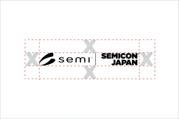
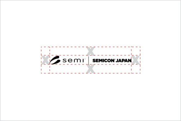
Use the size of a Gotham Ultra capital “X” with the same height as the word SEMICON as a guide for the clear space around the show logo.
Do not
The examples on this page illustrate incorrect show logo usage.
For the sake of brevity, only one version of the show logo is shown in the “Do not” examples. However, the rules apply to both the stacked and horizontal versions of the show logo.
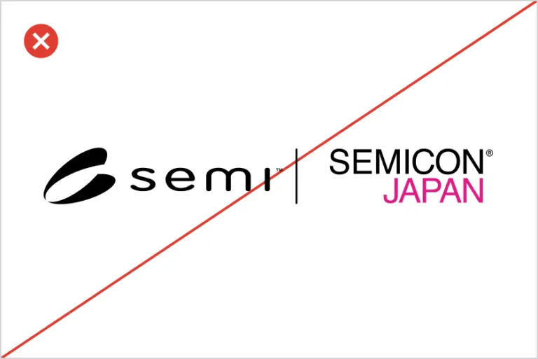
Do not build the show logo from scratch.
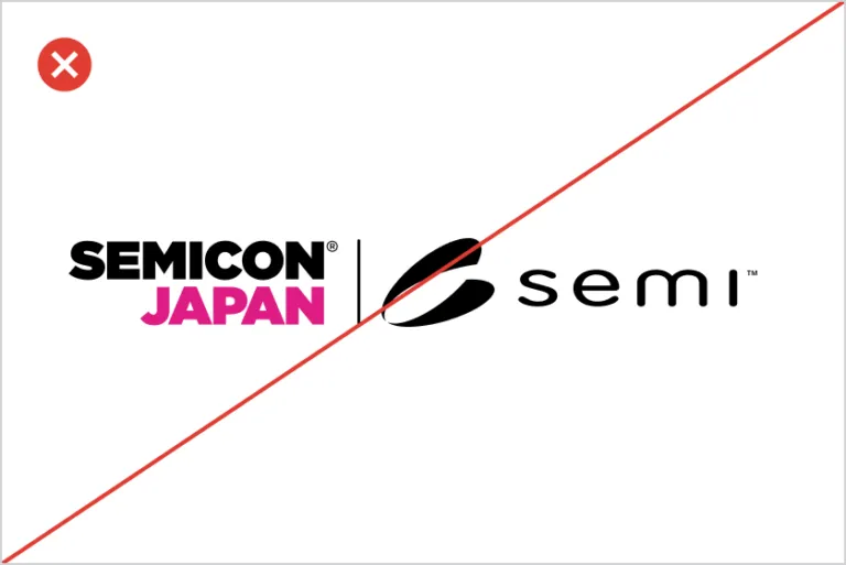
Do not change alignment of the show logo parts.
Do not use unapproved colors or color combinations.
Do not tilt or angle the show logo.
Do not modify, shear or warp the show logo.
Do not place the show logo over busy photography.
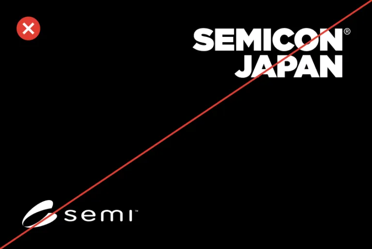
Do not split the show logo into parts.
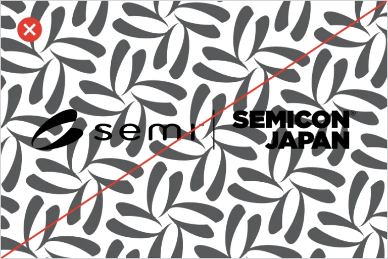
Do not place the show logo over patterns.